mVizuo Mobile App for Android
| MN-VIZUO-EN |
2020-03-02 |

1. Functions Change Log
| Release Date | Version | Functions Change | Name Account Change |
| 2020-03-02 |
1.0
|
Create page to change account information |
trungtin.nguyen@daviteq.com |
| 2020-08-18 | 1.0 | Complete documentation | trungtin.nguyen@daviteq.com |
2. Installation
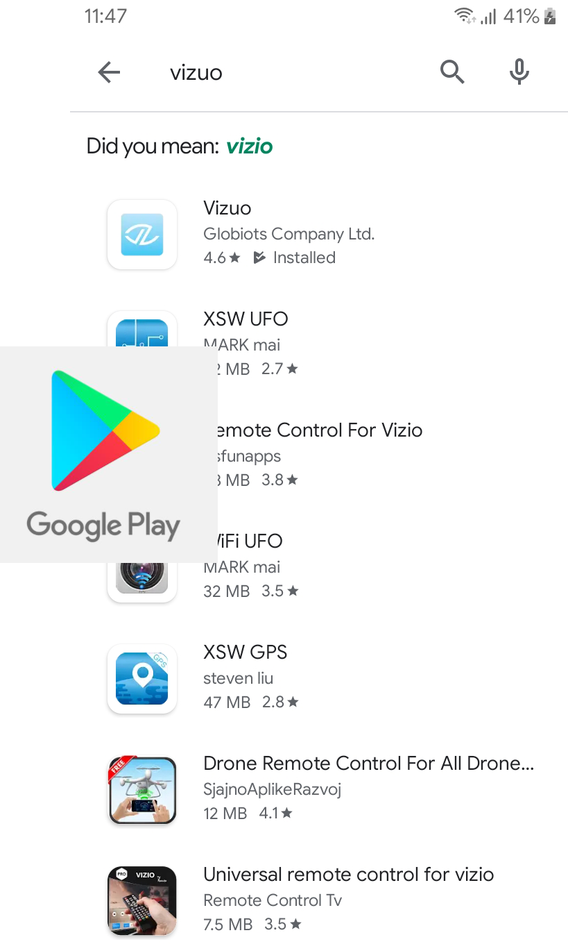
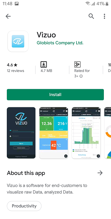
To find the App manually, navigate to the Google Play Store Select INSTALL to begin the download.
and search “vizuo”.
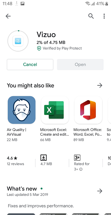
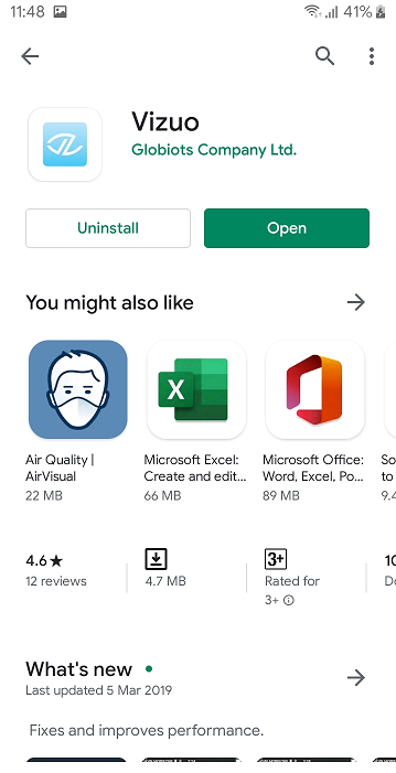
Please wait while the Vizuo Mobile App is being downloaded Select open to start using the Vizuo Mobile App.
and installed.
3. Account Information
3.1. Login
When you open the Vizuo Mobile App you may be asked to Login. Follow the steps to learn how to successfully log into
your account.
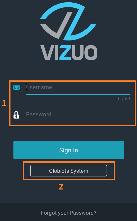
Note:
1. Form login - where to fill login information (username, password). Input your username and password, then select Sign In.
2. Where to choose the server. By default, the application will point to the cloudGlobiots service of Daviteq. If you want to point to another server, select Globiots System, then select Location Customize
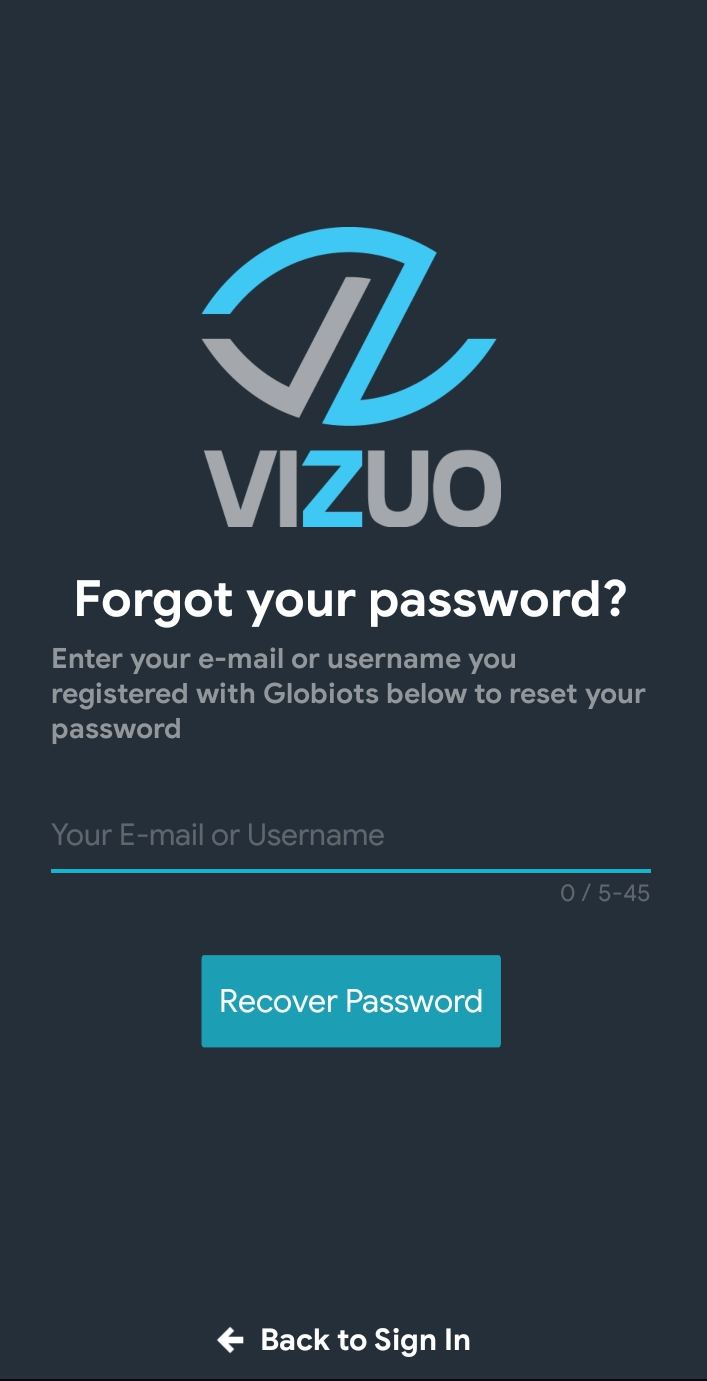
3.2. Forgot password
If you cannot remember your password, select Forgot your password, then input your email address and select Recover Password.
3.3. Change the account information
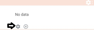
To change account information, click on the icon  in the upper left of the screen, then select Settings, the screen appears interface settings as follows:
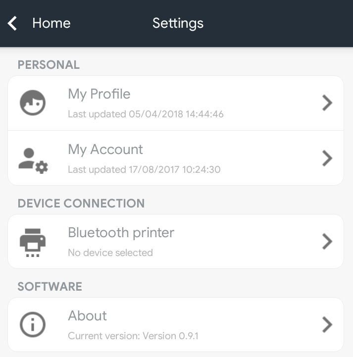
- My Profile: View and change information: Name, Password, Email, ..
- My Account: View product package information, access management.
- Bluetooth printer: Select a printing device that transmits a Bluetooth signal.
- About: View the current version of the software.
3.4. Log out
Click on the icon in the upper left of the screen, then select Sign Out
4. Dashboard
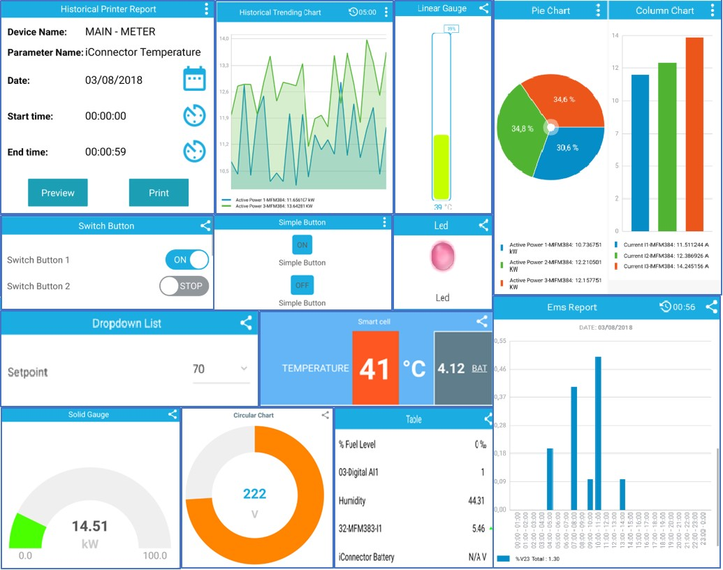
Dashboard is the place to display the current value (Realtime) or the value from the database of parameters. Dashboard can also record values and control status for parameters. Each Dashboard is organized in a tab. When the displayed value is from the database, the dashboard will update the value after a specified time. Dashboard includes the widgets inside as shown below:
Main Screen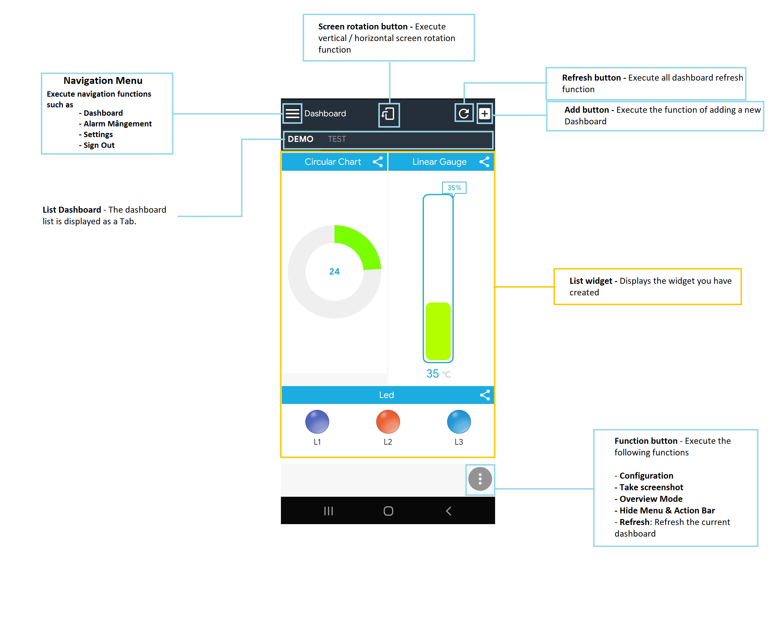
4.1 Create a Tab in Dashboard
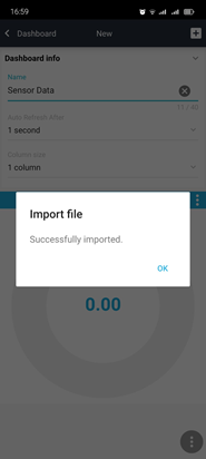
At the Dashboard interface, click the  icon in the right corner of the screen to declare the Dashboard configuration as follows:
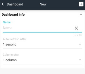
The meaning of the fields in the interface above:
-
- Name: Dashboard name, enter up to 40 characters.
- Auto Refresh After: Time Dashboard automatically updates Realtime value, choose 1-5 seconds.
- Column size: Number of columns created in Dashboard, choose 1-5 columns.
For example, selecting 3 columns means that it will divide the screen into 3 parts vertically.
Once done, click the Add icon in the upper right corner to create the Widget.
The widget list interface appears as follows: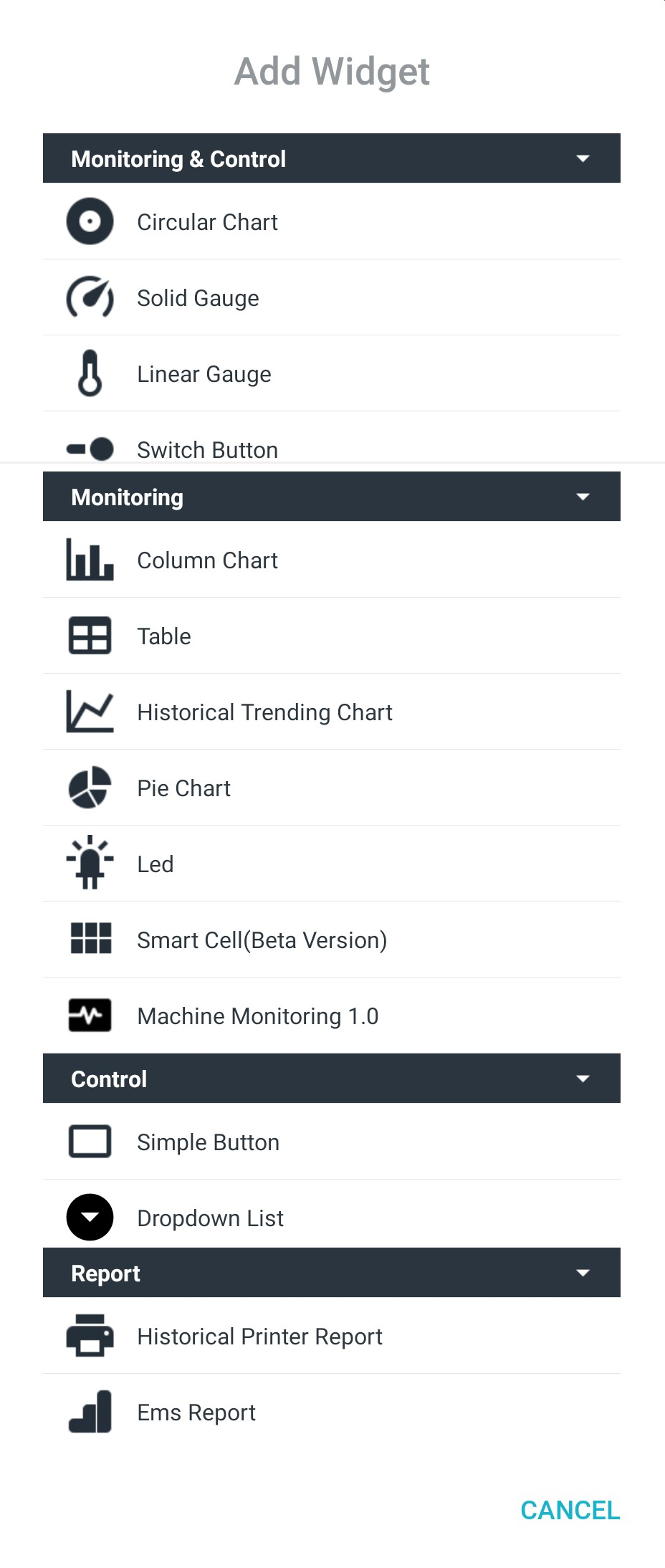
Proceed to create a Widget (details in Widget section).
Then select Save in the upper right corner of the screen, select Configure  Configure select Add to complete creating Dashboard containing the Widget that we have selected.
4.2 Duplicate Dashboard
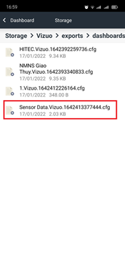
To duplicate a dashboard, implement export original dashboard and import it to same user and different user
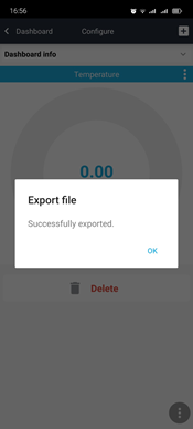
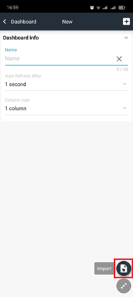
1. Export original dashboard
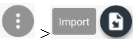
In the bottom right corner of the original dashboard, click the icon

, click No Folder to Select and then pop up menu will inform the successful import

2. Import dashboard
If original dashboard needs to import to another account. log out current account and log in to another account. At the Dashboard interface, click the  icon in the right corner of the screen then select
 and choose the original dashboard file then click
 and a popup menu for import successfully will appear. Click <Dashboard, click Add to complete import the dashboard
4.3 Create a Widget in Tab
A. Monitoring & Control Group
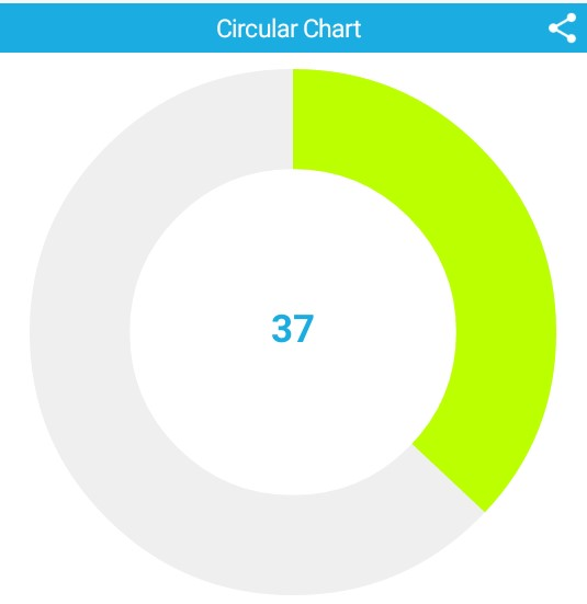
1. Circular Chart
From the list of widget types as above, choose the Circular Chart interface that appears as follows:

- Title: Set a name and format for the Title of the Widget.
- Bold: Drag
 right to bold.
 - Italic: Drag right to italicize.
- Underline: Drag right to underline.
- Background Color: To select a color for the background.
- Font size: Select a size for Title (Small – Normal – Large).
- Bold: Drag
- Full Column: Drag to the right, so that the Widget displays the full width of the Dashboard.
- Property: Set the Min, Max value that the parameter can reach.
- Write: Drag right to allow writing down a parameter (for a parameter with a hex address of 3000-31FF)
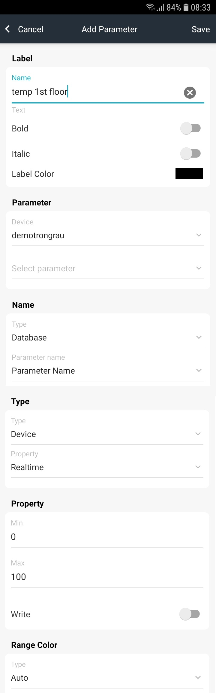
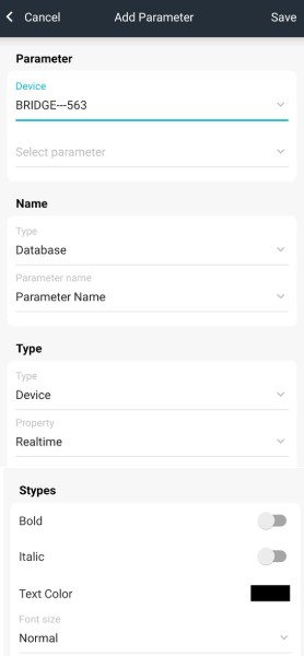
- Parameter: Click on Parameter, then select Add in the upper right corner of the screen.
The interface appears as follows:

- Parameter: Select parameters to display
- To select the device name, click on the dropdown list under Device
- Do the same for the Parameter
- Name: Select a name to display
- Select a name according to the database name (Select Database
 Select Parameter Name).
 - For custom naming (Select Constant Enter a name for the Parameter Name).
- Select a name according to the database name (Select Database
- Type: Select the parameter type to display (last log data from Database (Last value) / real time value (realtime value) from Device.
- Stypes: The parameter format is displayed in the Configuration Parameter List.
After the configuration is complete, the interface displayed on the Dashboard screen is as follows:
2. Solid Gauge
From the list of widget types as above, choose the Solid Gauge interface that appears as follows:
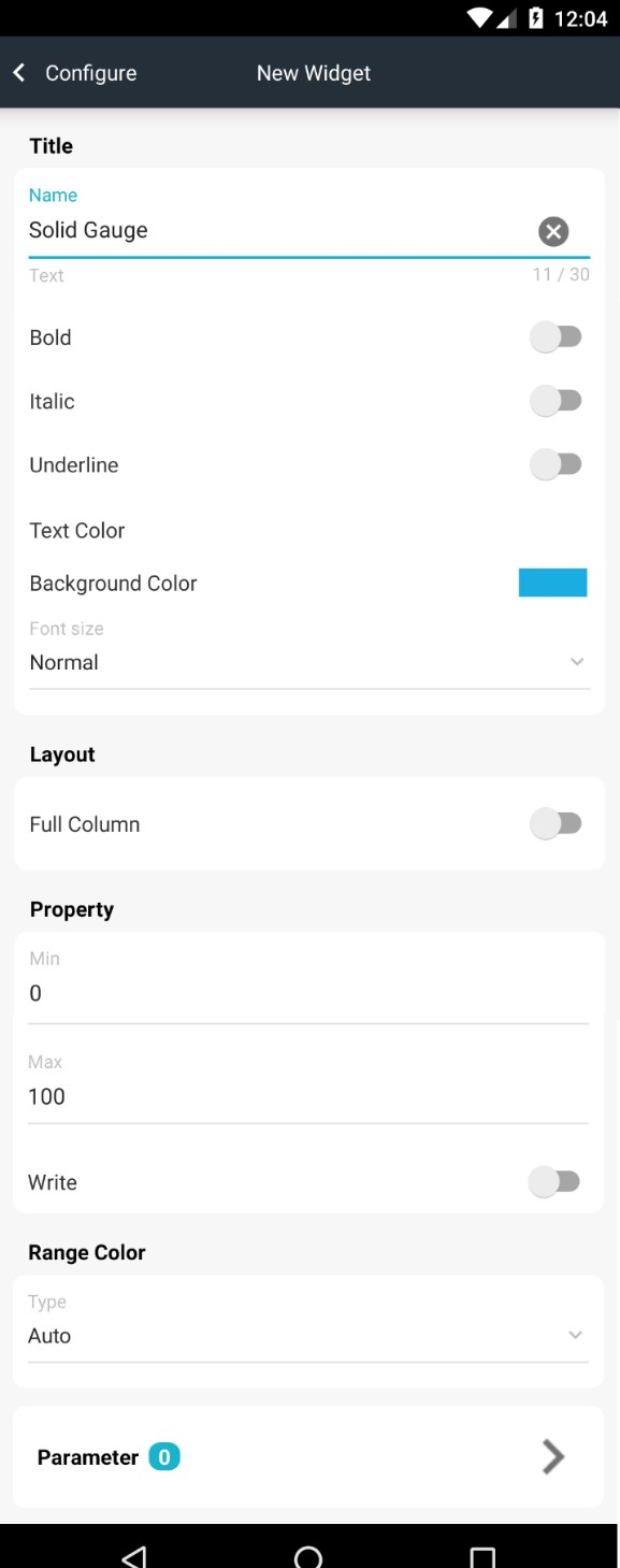
- Title: Set a name and format for the Title of the Widget.
- Bold: Drag right to bold.
- Italic: Drag right to italicize.
- Underline: Drag right to underline.
- Background Color: To select a color for the background.
- Font size: Select a size for Title (Small – Normal – Large).
- Bold: Drag
- Full Column: Dragto the right, so that the Widget displays the full width of the Dashboard.
- Property: Set the Min, Max value that the parameter can reach.
- Write: Dragright to allow writing down a parameter (for a parameter with a hex address of 3000-31FF)
- Parameter: Click on Parameter, then select Add in the upper right corner of the screen.
The interface appears as follows:

- Parameter: Select parameters to display
- To select the device name, click on the dropdown list under Device
- Do the same for the Parameter
- Name: Select a name to display
- Select a name according to the database name (Select Database Select Parameter Name).
- For custom naming (Select Constant Điền tên vào Parameter Name).
- Select a name according to the database name (Select Database
- Type: Select the parameter type to display (last log data from Database (Last value) / real time value (realtime value) from Device.
- Stypes: The parameter format is displayed in the Configuration Parameter List.
After the configuration is complete, the interface displayed on the Dashboard screen is as follows:
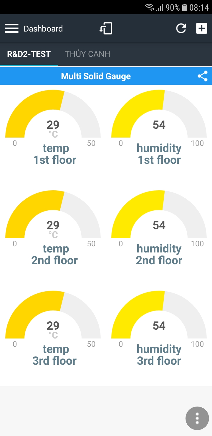
3. Multi Solid Gauge
From the list of widget types as above, choose the Multi Solid Gauge interface that appears as follows:
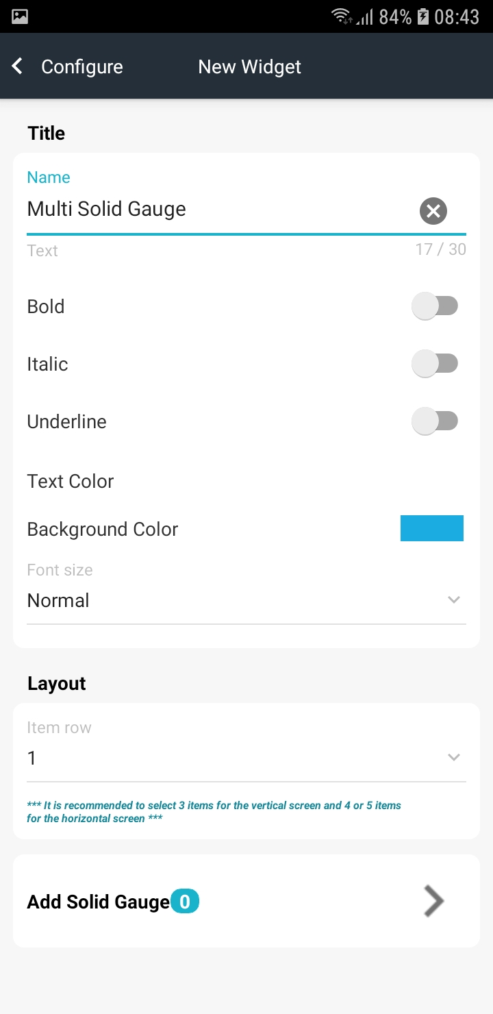
- Title: Set a name and format for the Title of the Widget.
- Name: Enter the name you want to display.
- Bold: Drag right to bold.
- Italic: Drag right to italicize.
- Underline: Drag right to underline.
- Text Color: To choose the color of the text.
- Background Color: To select a color for the background.
- Font size: Select a size for Title (Small – Normal – Large).
- Layout
- Item row: Select the number of solid gauges displayed per line (from 1 to 5 solid gauges).
- Add Solid Gauge: Click Select Add Solid Gauge, then select Add in the upper right corner of the screen.
The interface appears as follows:
- Label: Name and format Label for Solid gauge.
- Name: Enter the name you want to display.
- Bold: Drag right to bold.
- Italic: Drag right to italicize.
- Label Color: To select the color of the text.
- Parameter: Select parameters to display
- To select the device name, click on the dropdown list under Device
- Do the same for the Parameter
- Name: Select a name to display
- Select a name according to the database name (select Database select Parameter Name).
- For custom naming (Select Constant Enter a name for the Parameter Name).
- Select a name according to the database name (select Database
- Type: Select the parameter type to display (last log data from Database (Last value) / real time value (realtime value) from Device.
- Property: Set the Min, Max value that the parameter can reach as well as allowing to write down the parameter for the parameter (for parameters with hex address 3000-31FF).
- Min: the lowest value the parameter can reach.
- Max: the highest value the parameter can reach.
- Write: Drag right to enable writing down for the parameter.
- Range Color: Select a display color area
- Automatic color zone (Select Auto).
- Custom color zones (Select Custom Select Add range color The interface appears as below).
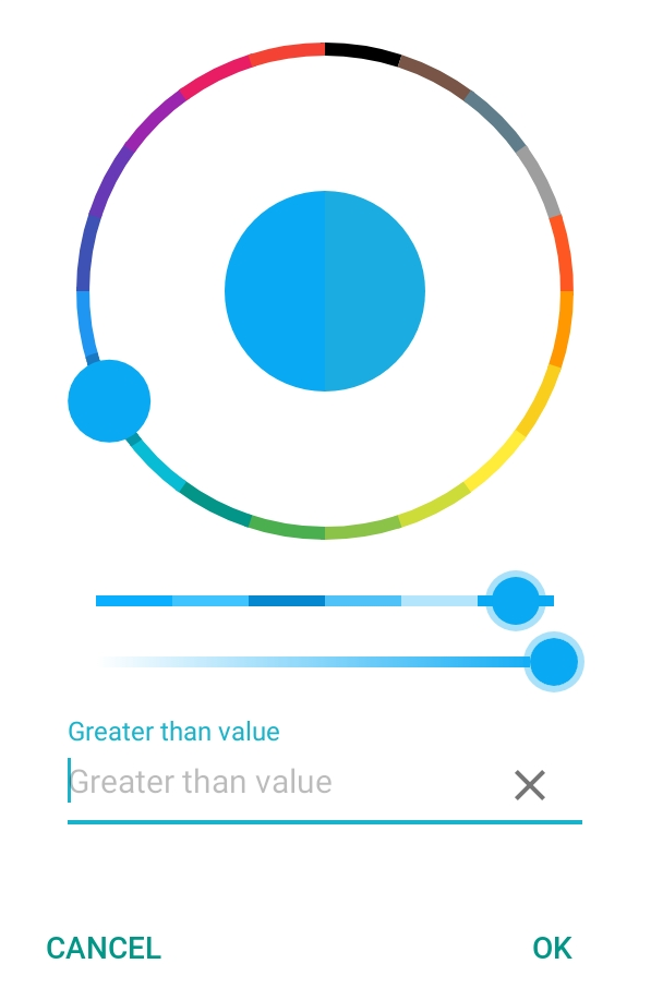
Here we fill in the value and select Select the color you want to display. Then press Select OK to finish the process.
After the configuration is complete, the interface displayed on the Dashboard screen is as follows:
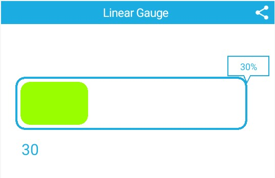
4. Linear Gauge
From the interface list of widgets as above, select Linear Gauge The interface appears as follows:
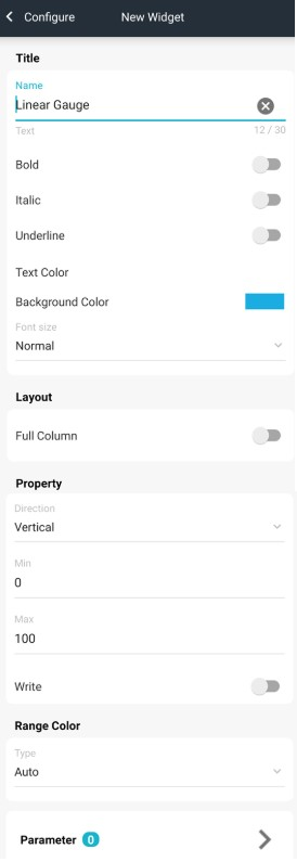
- Title: Set a name and format for the Title of the Widget.
- Bold: Drag right to bold.
- Italic: Drag right to italicize.
- Underline: Drag right to underline.
- Background Color: To select a color for the background.
- Font size: Select a size for Title (Small – Normal – Large).
- Bold: Drag
- Full Column: Dragto the right, so that the Widget displays the full width of the Dashboard.
- Property:
- Select the horizontal style (Horizontal) or vertical style (Vertical)
- Set the Min, Max value that the parameter can reach.
- Write: Dragright to allow writing down a parameter (for a parameter with a hex address of 3000-31FF)
- Parameter: Click on Parameter, then select Add in the upper right corner of the screen.
The interface appears as follows:

- Parameter: Select parameters to display
- To select the device name, click on the dropdown list under Device
- Do the same for the Parameter
- Name: Select a name to display
- Select a name according to the database name (Select Database Select Parameter Name).
- For custom naming (Select Constant Enter a name for the Parameter Name).
- Select a name according to the database name (Select Database
- Type: Select the parameter type to display (last log data from Database (Last value) / real time value (realtime value) from Device.
- Stypes: The parameter format is displayed in the Configuration Parameter List.
After the configuration is complete, the interface displayed on the Dashboard screen is as follows:
5. Switch Button
From the list of widget types as above, choose the Switch Button interface that appears as follows:
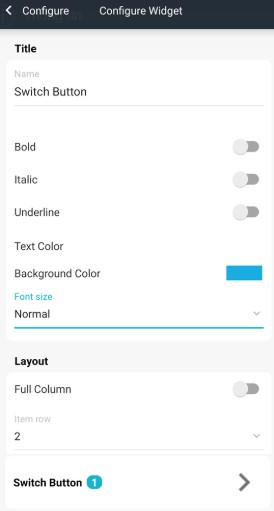
- Title: Name and format the title of the Title
- Layout :
- Full Column: Dragright to show the full column for Widget
- Item row: Select 1-5 columns
- Full Column: Drag
- Switch Button: Click Add to configure the Widget
The interface appears as follows:
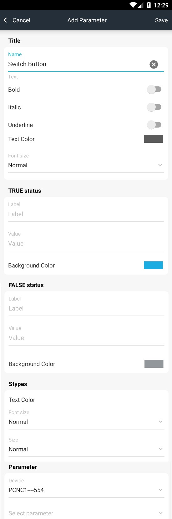
- Title: Implementation is similar to the parameter setting interface for the Widget
- TRUE status:
- Label: name displayed when in True state
- Value: setting value to write down parameter
- Background color: background color when in True state
- FALSE status:
- Label: name displayed when in False state
- Value: setting value to write down parameter
- Background color: background color when in False state
- Stypes:
- Text color: the text color shows the status
- Font size: font size settings
- Size: switch button size
- Parameter: Select parameters to display
- To select the device name, click on the dropdown list under Device
- Do the same for the Parameter
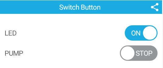
After the configuration is complete, the interface displayed on the Dashboard screen is as follows:
B. Monitoring Group
1. Column Chart
From the list of widget types as above, choose the Column Chart interface that appears as follows:
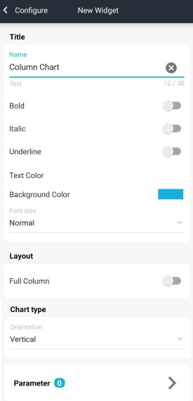
- Title: Set a name and format for the Title of the Widget.
• Bold: Drag right to bold.
• Italic: Drag right to italicize.
• Underline: Drag right to underline.
• Background Color: To select a color for the background.
• Font size: Select a size for Title (Small – Normal – Large). - Layout
• Full Column: Dragto the right, so that the Widget displays the full width of the Dashboard. - Chart Type:
• Select the horizontal style (Horizontal) or vertical style (Vertical) - Parameter: Click on Parameter, then select Add in the upper right corner of the screen.
The interface appears as follows:

- Parameter: Select parameters to display
- To select the device name, click on the dropdown list under Device
- Do the same for the Parameter
- Name: Select a name to display
- Select a name according to the database name (Select Database Select Parameter Name).
- For custom naming (Select Constant Enter a name for the Parameter Name).
- Select a name according to the database name (Select Database
- Type: Select the parameter type to display (last log data from Database (Last value) / real time value (realtime value) from Device.
- Stypes: The parameter format is displayed in the Configuration Parameter List.
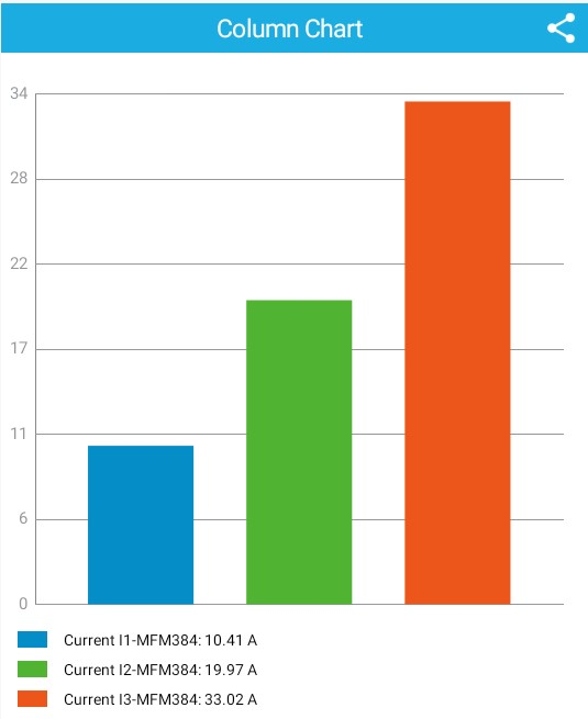
After the configuration is complete, the interface displayed on the Dashboard screen is as follows:
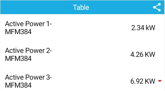
2. Table
From the list of widget types as above, choose the Table interface that appears as follows:
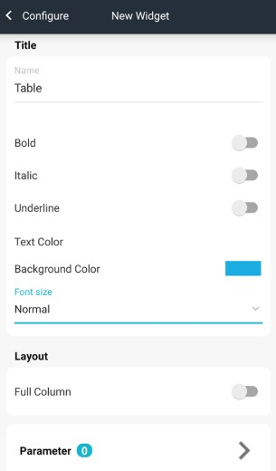
- Title: Set a name and format for the Title of the Widget.
- Bold: Drag right to bold.
- Italic: Drag right to italicize.
- Underline: Drag right to underline.
- Background Color: To select a color for the background.
- Font size: Select a size for Title (Small – Normal – Large).
- Bold: Drag
- Full Column: Dragto the right, so that the Widget displays the full width of the Dashboard.
- Parameter: Click on Parameter, then select Add in the upper right corner of the screen.
The interface appears as shown below:
- Parameter: Select parameters to display
- To select the device name, click on the dropdown list under Device
- Do the same for the Parameter
- Name: Select a name to display
- Select a name according to the database name (Select Database Select Parameter Name).
- For custom naming (Select Constant Enter a name for the Parameter Name).
- Select a name according to the database name (Select Database
- Type: Select the parameter type to display (last log data from Database (Last value) / real time value (realtime value) from Device.
- Stypes: The parameter format is displayed in the Configuration Parameter List.
After the configuration is complete, the interface displayed on the Dashboard screen is as follows:
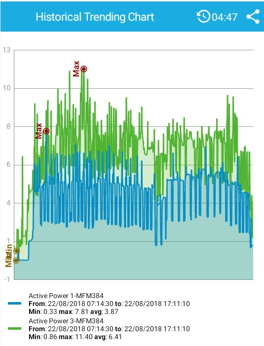
3. Historical Trending Chart
From the list of widget types as above, choose the Historical Trending Chart interface that appears as follows:
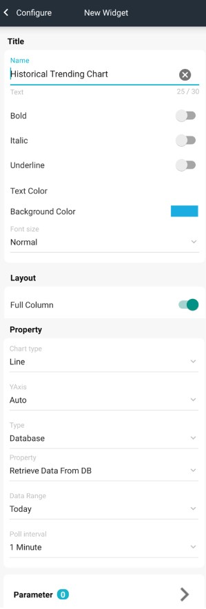
- Title: Set a name and format for the Title of the Widget.
- Bold: Drag right to bold.
- Italic: Drag right to italicize.
- Underline: Drag right to underline.
- Background Color: To select a color for the background.
- Font size: Select a size for Title (Small – Normal – Large).
- Bold: Drag
- Full Column: Dragto the right, so that the Widget displays the full width of the Dashboard.
- Property:
- Chart Type: Select the chart style, line (Line), curve (Spline), column (Area), region (Spline Area)
- YAxis: Give the y-axis an automatic (Auto) or an adjusted (Fixed) value.
- Type:
+ Database: If you want to get data from the database (Property: Get the latest data updated into the database (Last value) or retrieve data from the database (Retrieve Data from DB) specifying the date of retrieving data (Data range: Today, yesterday, last 3 day, custom) and the time interval to retrieve data (poll interval: 1,5,10,15 minutes) ).
+ Device: Get real-time data from the device (Property: Realtime).
- Parameter: Click on Parameter, then select Add in the upper right corner of the screen.
The interface appears as follows:
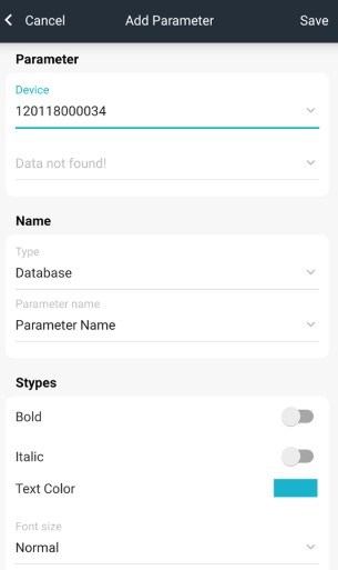
- Parameter: Select parameters to display
- To select the device name, click on the dropdown list under Device
- Do the same for the Parameter
- Name: Select a name to display
- Select a name according to the database name (Select Database Select Parameter Name).
- For custom naming (Select Constant Enter a name for the Parameter Name).
- Select a name according to the database name (Select Database
- Stypes: The parameter format is displayed in the Configuration Parameter List.
After the configuration is complete, the interface displayed on the Dashboard screen is as follows:
4. Pie Chart
From the list of widget types as above, choose the Pie Chart interface that appears as follows:
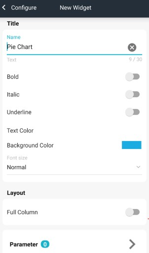
- Title: Set a name and format for the Title of the Widget.
- Bold: Drag right to bold.
- Italic: Drag right to italicize.
- Underline: Drag right to underline.
- Background Color: To select a color for the background.
- Font size: Select a size for Title (Small – Normal – Large).
- Bold: Drag
- Full Column: Dragto the right, so that the Widget displays the full width of the Dashboard.
- Parameter: Click on Parameter, then select Add in the upper right corner of the screen.
The interface appears as follows:

- Parameter: Select parameters to display
- To select the device name, click on the dropdown list under Device
- Do the same for the Parameter
- Name: Select a name to display
- Select a name according to the database name (Select Database Select Parameter Name).
- For custom naming (Select Constant Enter a name for the Parameter Name).
- Select a name according to the database name (Select Database
- Type: Select the parameter type to display (last log data from Database (Last value) / real time value (realtime value) from Device.
- Stypes: The parameter format is displayed in the Configuration Parameter List.
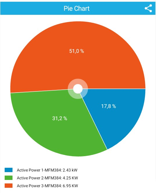
After the configuration is complete, the interface displayed on the Dashboard screen is as follows:
5. Led
From the list of widget types as above, choose the Led interface that appears as follows:
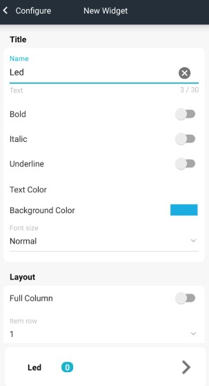
- Title: Set a name and format for the Title of the Widget.
- Bold: Drag right to bold.
- Italic: Drag right to italicize.
- Underline: Drag right to underline.
- Background Color: To select a color for the background.
- Font size: Select a size for Title (Small – Normal – Large).
- Bold: Drag
- Full Column: Dragto the right, so that the Widget displays the full width of the Dashboard.
- Item row: Select the number of columns in Widget, 1-5 columns
- Led : Click on Led, then select Add in the upper right corner of the screen.
The interface appears as follows:
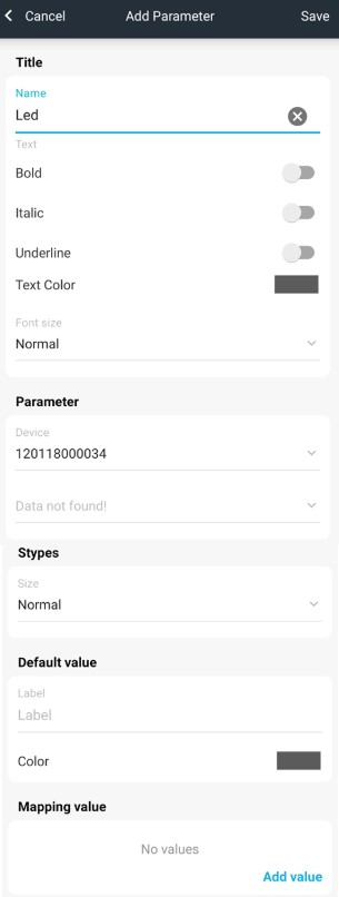
- Title: Name and format the Title of the Led.
- Bold: Drag right to bold.
- Italic: Drag right to italicize.
- Underline: Drag right to underline.
- Background Color: To select a color for the background.
- Font size: Select a size for Title (Small – Normal – Large).
- Bold: Drag
- Parameter: Select parameters to display
- To select the device name, click on the dropdown list under Device
- Do the same for the Parameter
- Stypes: The parameter format is displayed in the Configuration Parameter List.
- Default value: Choose values and colors for default display.
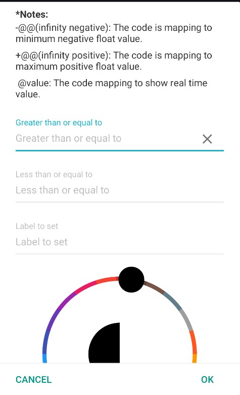
- Mapping value: To add value, press Add value, the interface screen appears as follows:
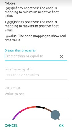
Greater than or equal to: Enter the lower threshold (>=)
• Less than or equal to: Enter the upper threshold (<=)
• Value to set: Enter the value and select the display color, when the parameter's value is within the range you set above.
After the configuration is complete, the interface displayed on the Dashboard screen is as follows:

6. Smart Cell
From the list of widget types as above, choose the Smart Cell interface appears as follows:
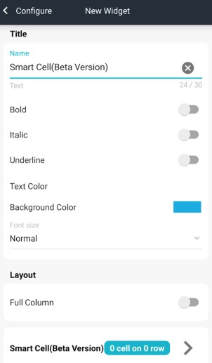
- Title: Set a name and format for the Title of the Widget.
• Bold: Drag right to bold.
• Italic: Drag right to italicize.
• Underline: Drag right to underline.
• Background Color: To select a color for the background.
• Font size: Select a size for Title (Small – Normal – Large).
• Full Column: Dragto the right, so that the Widget displays the full width of the Dashboard. - Smart Cell (Beta Version): Click to enter the smart cell creation screen. Then click
 to create a smart cell. The screen displays the interface as shown below

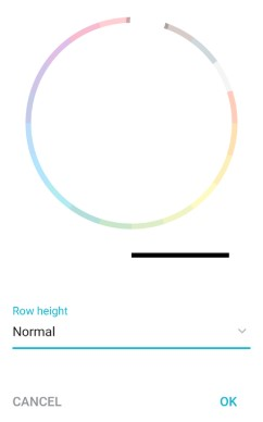
Row Height: Select line width (small, normal, large, Xlarge, XXlarge) Then click OK.
Then click on the icon  the right corner of your smart cell, as shown below:
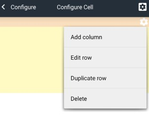
- Add Column: To add columns for smart cell
- Edit row: to edit smart cell
- Duplicate row: to clone a smart cell
- Delete: to delete a smart cell
Select Add Column: Then enter the number of % you want the created column to occupy in the smart cell (<=100). Then click OK.
Then click on the icon as shown below:

The interface appears as follows:
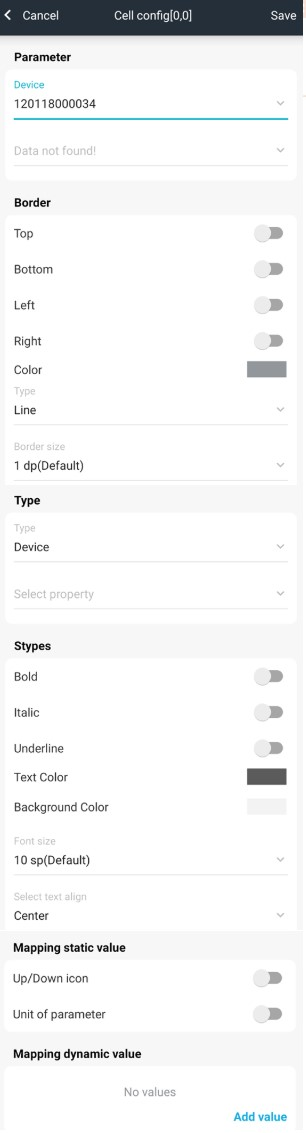
Parameter: Select parameters to display
-
- To select the device name, click on the dropdown list under Device
- Do the same for the Parameter
- Border:
- Drag to select to draw borders (top, bottom, left, right) for the smart cell.
- Type: line style (Line) or dotted line style (dotted line)
- Border size: for contour size (1,2,3,4,5dp)
- Drag
- Type:
- Device: Get real-time value from device (Property: Realtime)
- Constant: Set default values (Constant Name: Enter the name you want to display)
- Database: Select retrieved from database (Device Name: name of the device, Parameter Name: name of the parameter, Unit: units of the parameter, Last value: The latest parameter's value is updated to the database)
- Stypes: Format for the value displayed on the smart cell
- Bold: Drag right to bold.
- Italic: Drag right to italicize.
- Underline: Drag right to underline.
- Background Color: To select a color for the background.
- Font size: Select a size for Title (sp)
- Select text align: Display position of the parameter (center, left, right, top, button)
- Bold: Drag
- Mapping dynamic value: To add value, select Add value, the interface screen appears as follows:

- Greater than or equal to: Enter the lower threshold (>=)
- Less than or equal to: Enter the upper threshold (<=)
- Value to set: Enter the value and select the display color, when the parameter's value is within the range you set above.
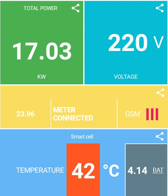
After the configuration is complete, the interface displayed on the Dashboard screen is as follows:
7. Machine Monitoring 1.0
From the interface in the list of widgets as above, select Machine monitoring 1.0 interface that appears as follows:
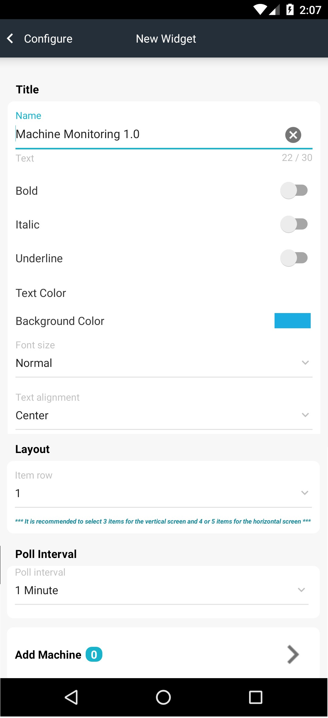
- Title: Set a name and format for the Title of the Widget.
- Bold: Drag right to bold.
- Italic: Kéo right to italicize.
- Underline: Drag right to underline.
- Background Color: To select a color for the background.
- Font size: Select a size for Title (Small – Normal – Large).
- Text alignment: Align for Title (Left – Center - Right).
- Bold: Drag
- Layout:
- Item row: Number of machines displayed per line (1-5 machines).
- Poll interval: Time to update the runtime value (1 minute - 5 minutes - 10 minutes - 15 minutes).
- Add machine: Select Add machine, Then select Add in the upper right corner of the screen. The screen appears as follows:
- Title: Name and format the Title of the Machine monitoring
- Name: Name of Machine monitoring
- Bold: Drag right to bold.
- Italic: Drag right to italicize.
- Text color: to select the text color to display.
- Realtime status parameter: select parameters to display realtime
- To select the device name, click on the dropdown list under Device.
- Do the same for the Parameter.
- Default status:
- Set the status name when in the default status on the label.
- Select the background color when in the default state in Color.
- Mapping status:Mapping value to display realtime. To create new values, click on Add a sites, the screen displays like this:

• Greater than or equal to: Enter the lower threshold (>=)
• Less than or equal to: Enter the upper threshold (<=)
• Label to set: Enter a status and background color to display
-
Runtime parameter: parameter selection to display the runtime value
- To select the device name, click on the dropdown list under Device.
-
Do the same for the Parameter.
-
Data range: choose a time for TODAY, YESTERDAY or CUSTOM
-
Select time: select the time point to get data from
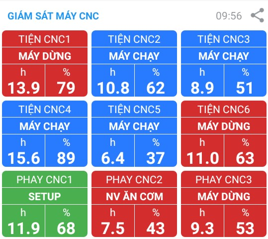
After the configuration is complete, the interface displayed on the Dashboard screen is as follows:
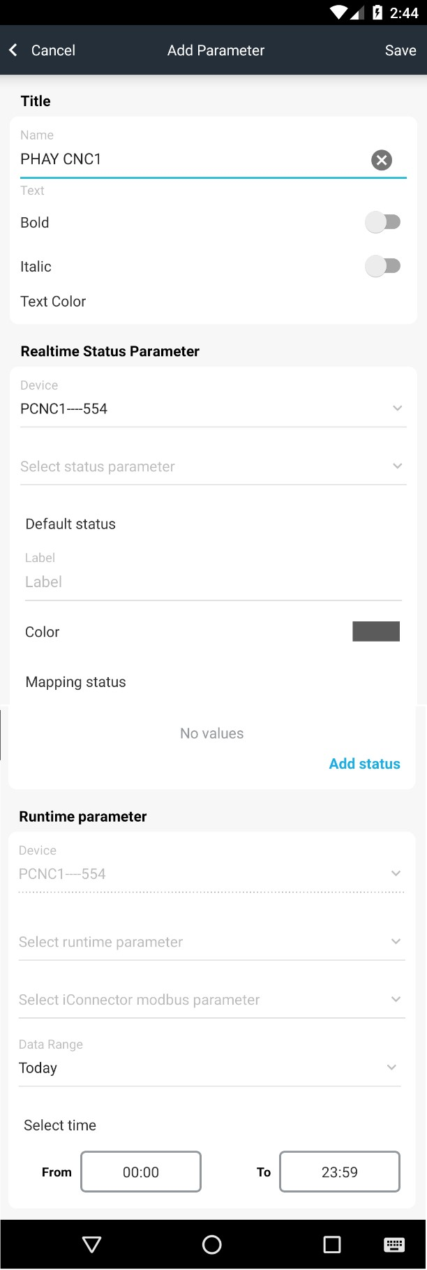
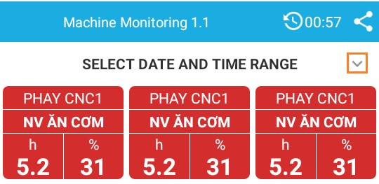
8. Machine Monitoring 1.1
From the list of widget types as above, choose the Machine monitoring 1.1 interface that appears as follows:
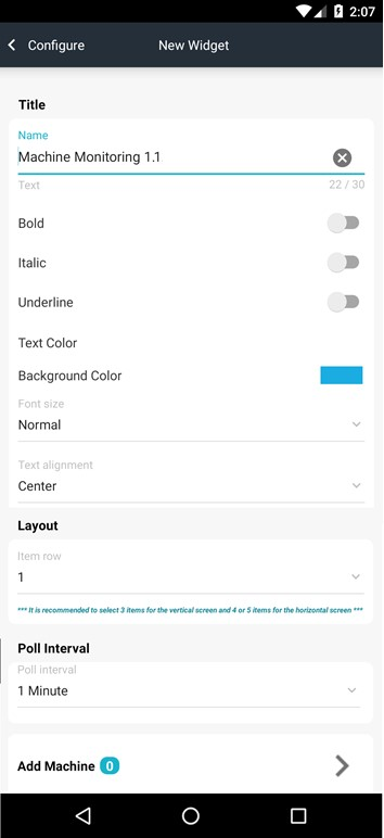
- Title: Set a name and format for the Title of the Widget.
- Bold: Drag right to bold.
- Italic: Drag right to italicize.
- Underline: Drag right to underline.
- Background Color: To select a color for the background.
- Font size: Select a size for Title (Small – Normal – Large).
- Text alignment: Align for Title (Left – Center - Right).
- Bold: Drag
- Layout:
- Item row: Number of machines displayed per line (1-5 machines).
- Poll interval: Time to update the runtime value (1 minute - 5 minutes - 10 minutes - 15 minutes).
- Add machine: Select Add machine, Then select Add in the upper right corner of the screen. The screen appears as follows:
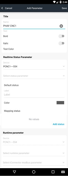
- Title: Name and format the Title of the Machine monitoring
- Name: Name of Machine monitoring
- Bold: Drag right to bold.
- Italic: Drag right to italicize.
- Text color: to select the text color to display.
- Realtime status parameter: select parameters to display realtime
- To select the device name, click on the dropdown list under Device.
- Do the same for the Parameter.
- Default status:
- Set the status name when in the default status on the label.
- Select the background color when in the default state in Color.
- Mapping status: mapping value to display realtime. To create new values click on Add staus, the screen displays like below:
• Greater than or equal to: Enter the lower threshold (>=)
• Less than or equal to: Enter the upper threshold (<=)
• Label to set: Enter a status and background color to display
- Runtime parameter: parameter selection to display the runtime value
- To select the device name, click on the dropdown list under Device.
- Do the same for the Parameter.
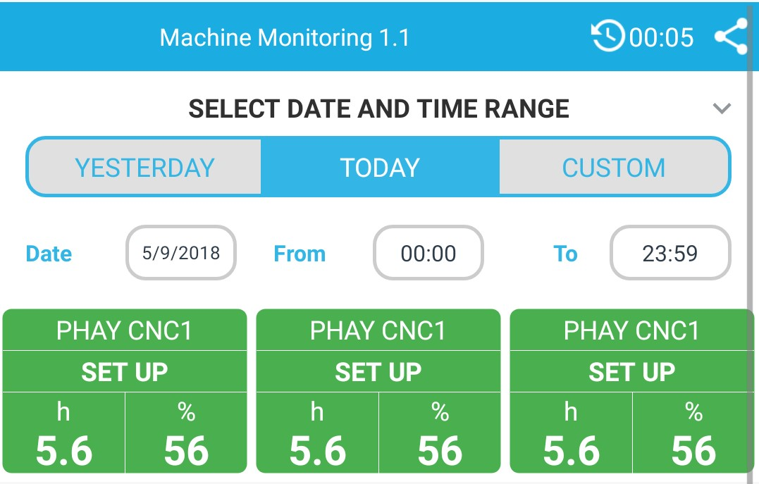
After the configuration is complete, the interface displayed on the Dashboard screen is as follows:
Here, we can directly configure the date and time selection as desired by touching the down arrow as shown above. The output interface looks like the following:
C. Control Group
1. Simple Button
From the list of widget types as above, choose the Simple button interface that appears as follows:
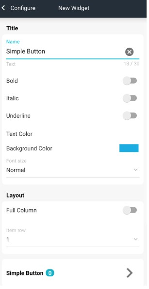
- Title: Set a name and format for the Title of the Widget.
- Bold: Drag right to bold.
- Italic: Drag right to italicize.
- Underline: Drag right to underline.
- Background Color: To select a color for the background.
- Font size: Select a size for Title (Small – Normal – Large).
- Bold: Drag
- Full Column: Dragto the right, so that the Widget displays the full width of the Dashboard.
- Item row: Select the number of columns in Widget, 1-5 columns
- Simple Button: Click theSimple button, then selectAdd in the upper right corner of the screen. The screen appears as follows:
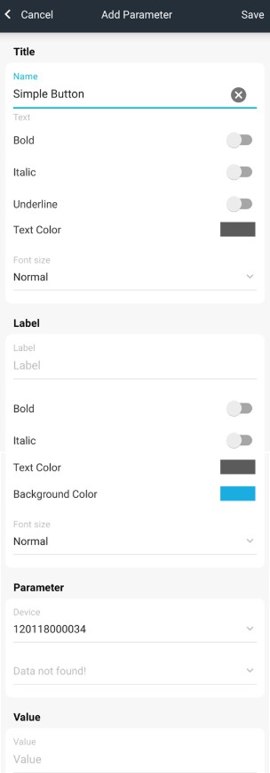
- Title: Name and format the Title of the Simple Button.
- Bold: Drag right to bold.
- Italic: Drag right to italicize.
- Underline: Drag right to underline.
- Background Color: To select a color for the background.
- Font size: Select a size for Title (Small – Normal – Large).
- Bold: Drag
- Lable: Display name and format for the Simple Button
- Parameter: Select parameters to display
- To select the device name, click on the dropdown list under Device
- Do the same for the Parameter
- Value: The value is written down for the parameter when the button is pressed.
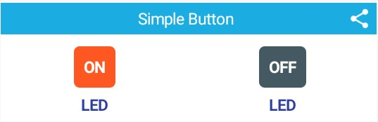
After the configuration is complete, the interface displayed on the Dashboard screen is as follows:
2. Dropdown List
From the list of widget types as above, choose the Dropdown list interface that appears as follows:
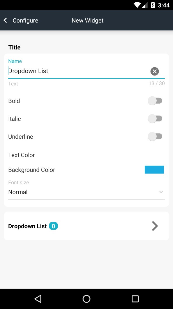
- Title: Set a name and format for the Title of the Widget.
- Bold: Drag right to bold.
- Italic: Drag right to italicize.
- Underline: Drag right to underline.
- Background Color: To select a color for the background.
- Font size: Select a size for Title (Small – Normal – Large).
- Bold: Drag
- Dropdown list: Click the dropdown list, then select Add in the upper right corner of the screen. The screen appears as follows:
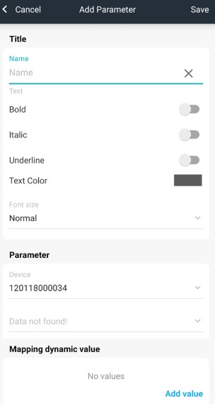
- Title: Name and format the Title of the Dropdown list.
- Bold: Drag right to bold.
- Italic: Drag right to italicize.
- Underline: Drag right to underline.
- Background Color: To select a color for the background.
- Font size: Select a size for Title (Small – Normal – Large).
- Bold: Drag
- Parameter: Select parameters to display
- To select the device name, click on the dropdown list under Device
- Do the same for the Parameter
- Mapping dynamic value: To add value, select Add value. The screen displays as follows:
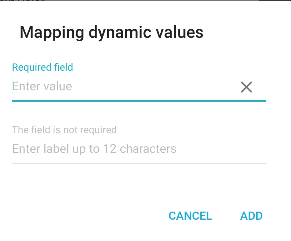
- Enter the value you want to write down the parameter in the Enter value field.
- Enter the label displayed in the dropdown list into the Enter label field.
- Then select ADD button to finish the mapping process.
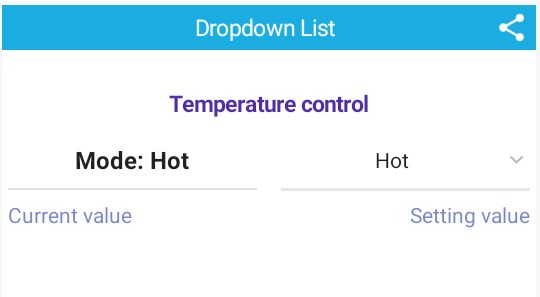
After the configuration is complete, the interface displayed on the Dashboard screen is as follows:
D. Report Group
1. Historical Printer Report
From the list of widget types as above, choose the Historical Printer Report interface that appears as follows:
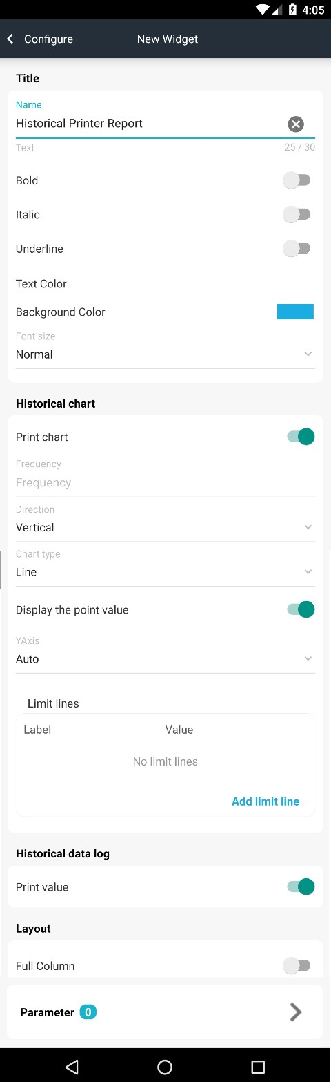
- Title: Set a name and format for the Title of the Widget.
- Bold: Drag right to bold.
- Italic: Drag right to italicize.
- Underline: Drag right to underline.
- Background Color: To select a color for the background.
- Font size: Select a size for Title (Small – Normal – Large).
- Bold: Drag
- Historical Chart: Drag to the right if you want to choose to print the histogram for the parameter (optional)
- Frequency: Set the frequency to get the parameter's value
- Direction: Direction of the chart
- Chart type: (line, spline, area, spline area)
- Display the point value: Drag right to display the value of each point on the chart.
- YAxis: Select the display style for the y-axis to be automatic (Auto) or manually set (Fix: enter Min, Max values)
- Add limit line: Set the chart line limit value if desired
- Historical data log:
- Print value: Drag right to display the value of each point on the chart.
- Print value: Drag
- Layout:
- Full Column Drag right, so that Widget displays the full Dashboard column.
- Full Column Drag
- Parameter: Click select Parameter, then select Add in the upper right corner of the screen.
The interface appears as shown below:

- Parameter: Select parameters to display
- To select the device name, click on the dropdown list under Device
- Do the same for the Parameter
- Name: Select a name to display
- Select a name according to the database name (Select Database Select Parameter Name).
- For custom naming (Select Constant Enter a name for the Parameter Name).
- Select a name according to the database name (Select Database
- Type: Select the parameter type to display (last log data from Database (Last value) / real time value (realtime value) from Device.
- Stypes: The parameter format is displayed in the Configuration Parameter List.
After the configuration is complete, the interface displayed on the Dashboard screen is as follows:
2. EMS Report
From the interface list of widgets as above, select Ems Report interface that appears as follows:
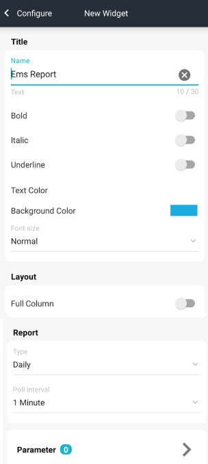
- Title: Set a name and format for the Title of the Widget.
- Bold: Drag right to bold.
- Italic: Drag right to italicize.
- Underline: Drag right to underline.
- Background Color: To select a color for the background.
- Font size: Select a size for Title (Small – Normal – Large).
- Bold: Drag
- Full Column: Dragto the right, so that the Widget displays the full width of the Dashboard.
Report:- Type: Select the report type Daily, weekly, monthly
- Poll Interval: choose the time to get data to report (1,5,10,15 minutes)
- Parameter: Click on Parameter, then select Add in the upper right corner of the screen.
The interface appears as follows:

- Parameter: Select parameters to display
- To select the device name, click on the dropdown list under Device
- Do the same for the Parameter
- Name: Select a name to display
- Select a name according to the database name (Select Database Select Parameter Name).
- For custom naming (Select Constant Enter a name for the Parameter Name).
- Select a name according to the database name (Select Database
- Type: Select the parameter type to display (last log data from Database (Last value) / real time value (realtime value) from Device.
- Stypes: The parameter format is displayed in the Configuration Parameter List.
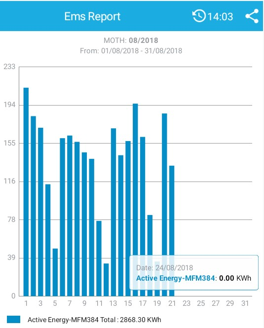
After the configuration is complete, the interface displayed on the Dashboard screen is as follows:
5. Alarm Management
From the Dashboard interface click on the icon  top left of the screen Select icon
  interface that appears as follows:
We have 3 options Alarm Summary, Alarm Detail, Alarm History. Default is Alarm Summary Click icon  to change in the upper right of the screen select Alarm Detail or Alarm History. For example select Alarm Detail, the interface appears as follows:
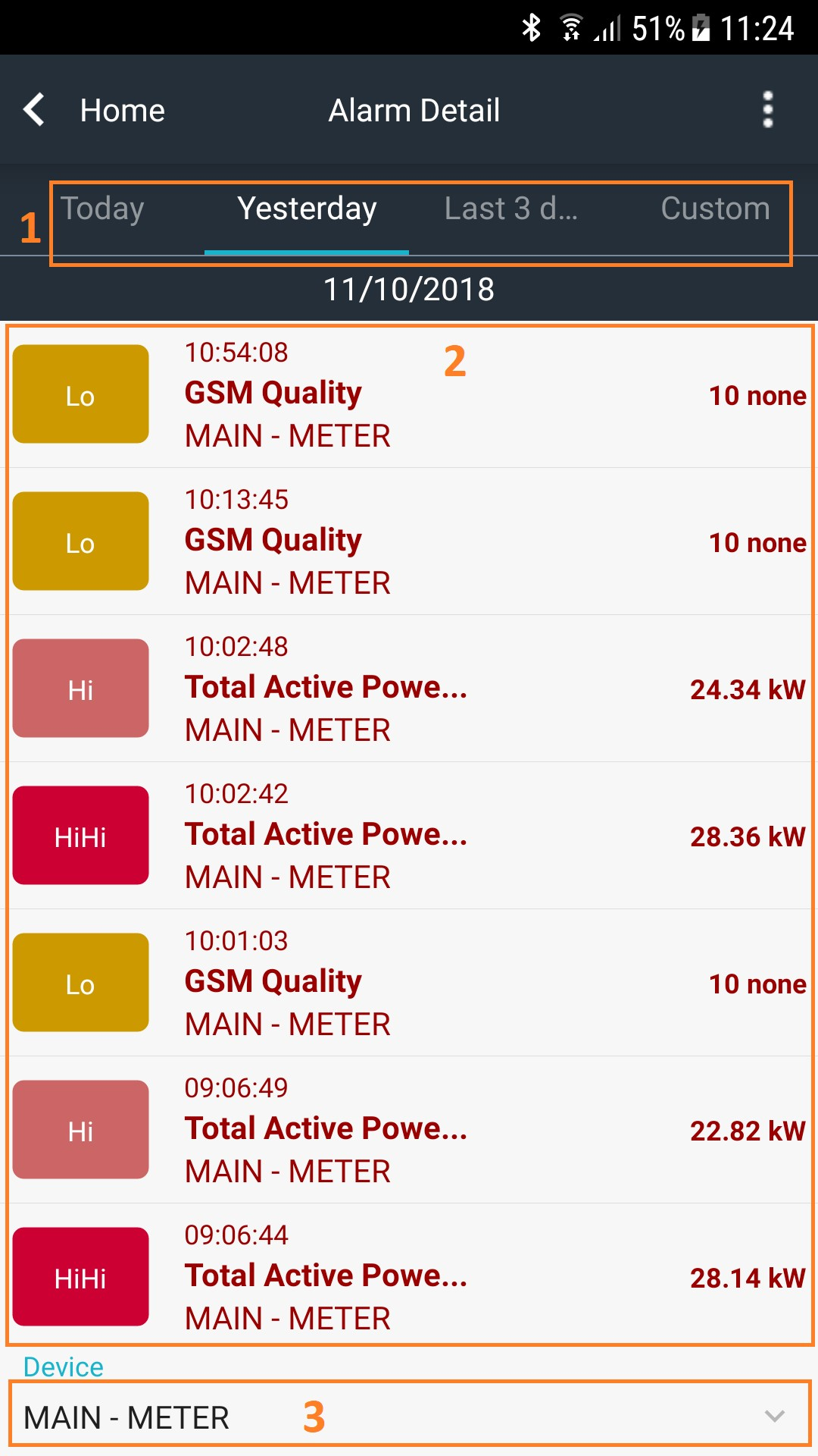
The interface is divided into 3 main areas as follows:
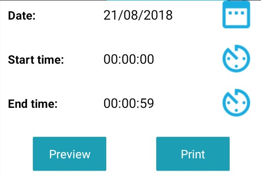
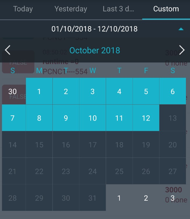
- 1st zone: Include tabs like: Today, Yesterday, Last 3 days and Custom. Here we can select each tab corresponding to each specific time. When you click Custom click select icon
 interface that appears as follows:


Here, we can choose any date or choose from a range (up to 1 month). Selecting dates by range, we just need to choose start and end dates. The system will help us choose the dates within the range we selected above. For example, as shown above, we just need to choose the start date as 1 and the end date is 12, then the date from 2 to 11 the system will choose for us. Then click on the icon  to finish the date selection process.
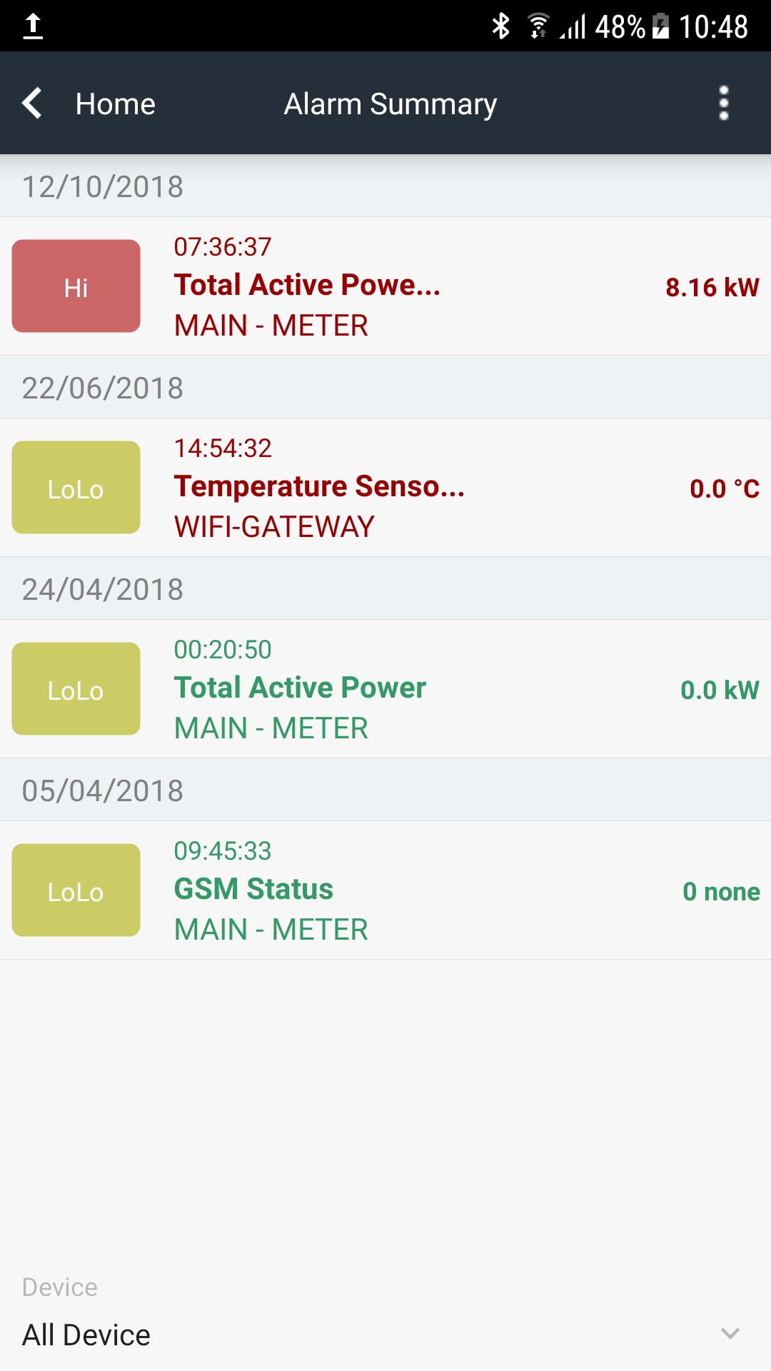
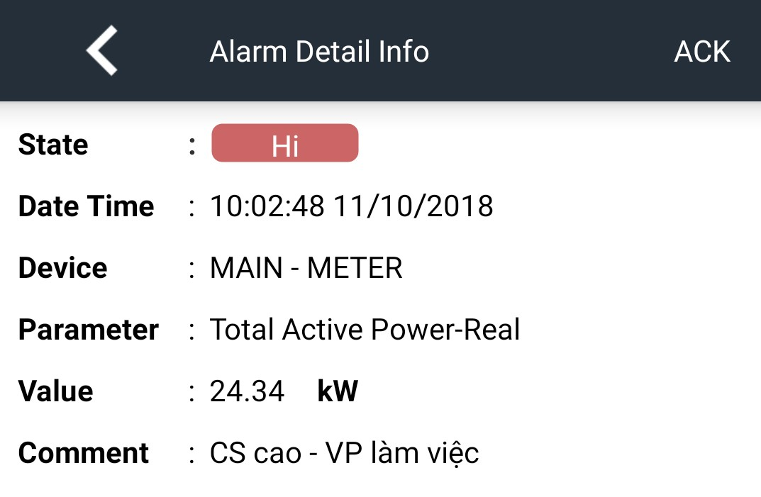
- 2nd zone: Displays a list of alarm types as well as alarm status (LoLo: very low; Lo: low; Hi: high; HiHi: very high) and processing status (red warning text: not processed, blue warning text: in progress). When we click on any warning, the system will output the detailed interface as follows (for example, choose the type of warning with red text - not processed)
To handle warnings as well as provide handling solutions, we choose the icon  in the top right corner of the screen. The interface appears as follows:
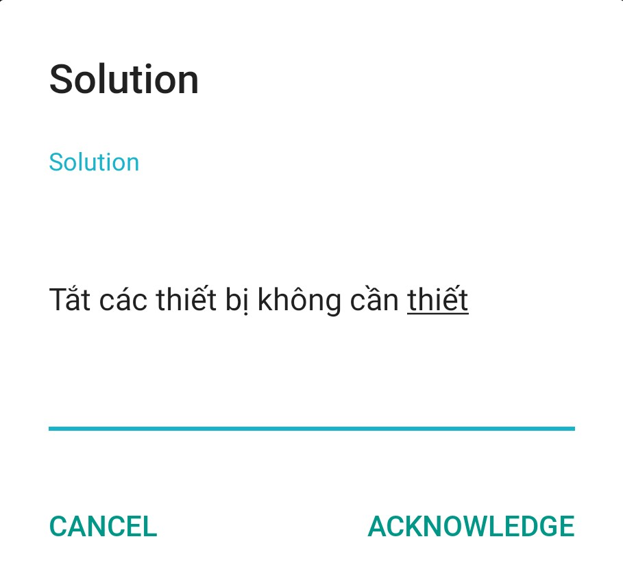
After entering the solution, click ACKNOWLEDGE and wait for the system to process, if successful, the interface appears as follows.:
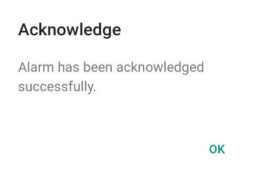
Then click OK, the interface appears as follows:
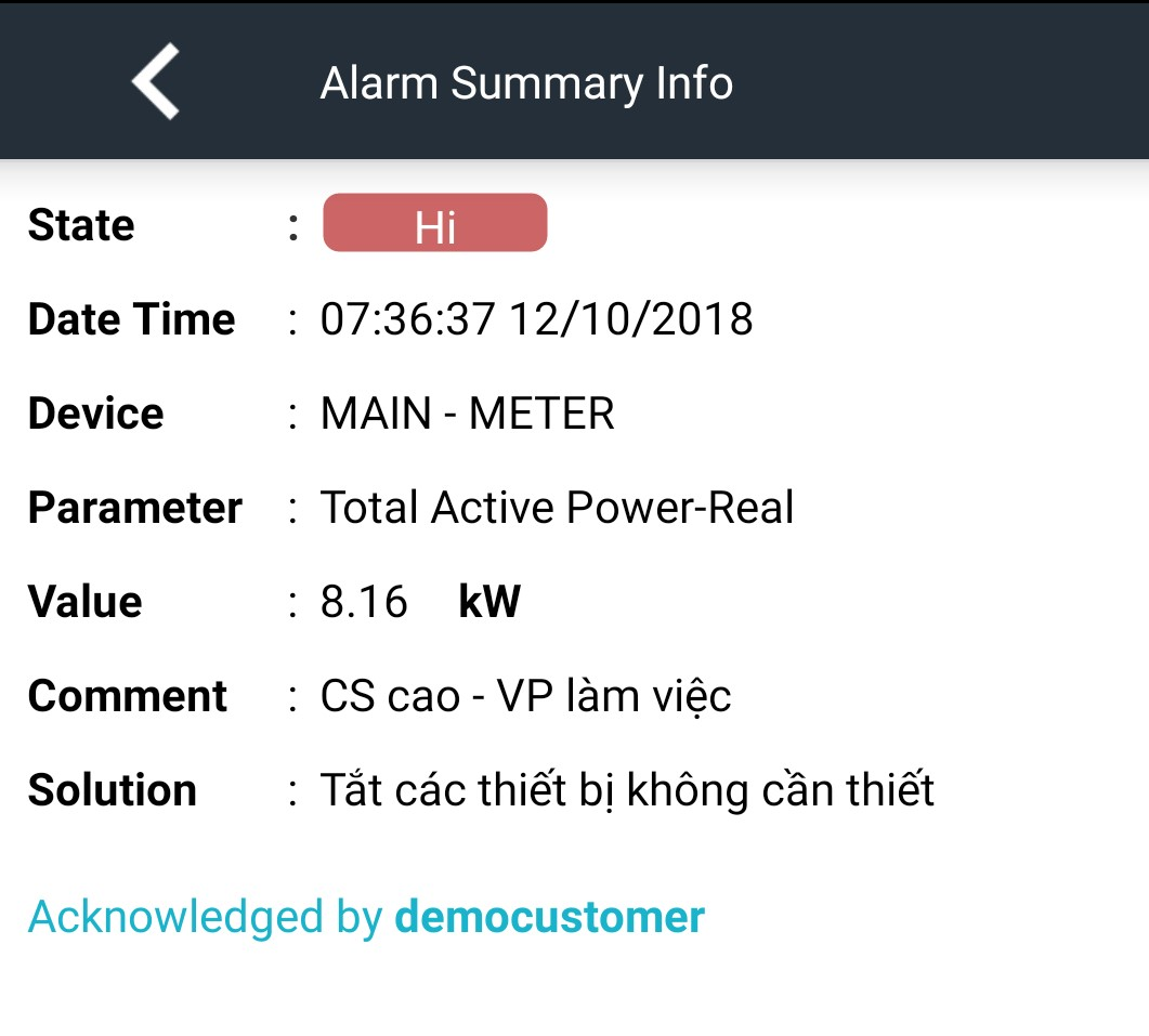
Now at the warning details screen appears the words "Acknowledged by democustomer" (by democustomer: taken from the login account). Then click on the icon  to return to the main screen.
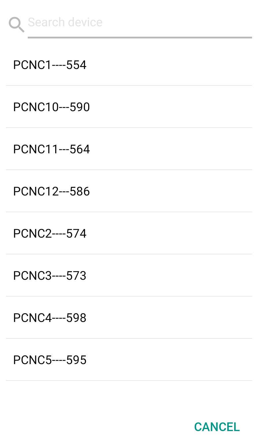
- 3rd zone: Here we can select each Device specific by clicking the icon
 interface that appears as follows:

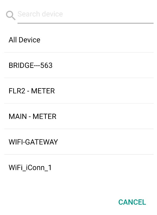
Do the same for the Alert Summary and Alarm History.
6. Event Management
From the Dashboard interface click on the icon top left of the screen Select icon  interface that appears as follows:
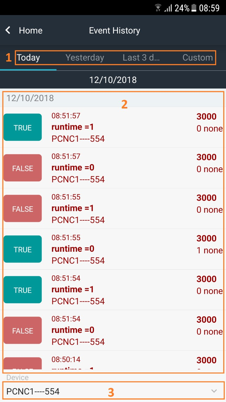
The interface is divided into 3 main areas as follows:
- 1st zone: Include tabs like: Today, Yesterday, Last 3 days and Custom. Here we can select each tab corresponding to each specific time. When clicked Custom click select icon interface that appears as follows:
Here, we can choose any date or choose from a range (up to 1 month). Selecting dates by range, we just need to choose start and end dates. The system will help us choose the dates within the range we selected above. For example, as shown above, we just need to choose the start date as 1 and the end date is 12, then the date from 2 to 11 the system will choose for us. Then click on the icon to finish the date selection process.
- 2nd zone: Displays a list of event types as well as event status (TRUE or FALSE). When we click on any event, the system will output the event detail interface as follows:
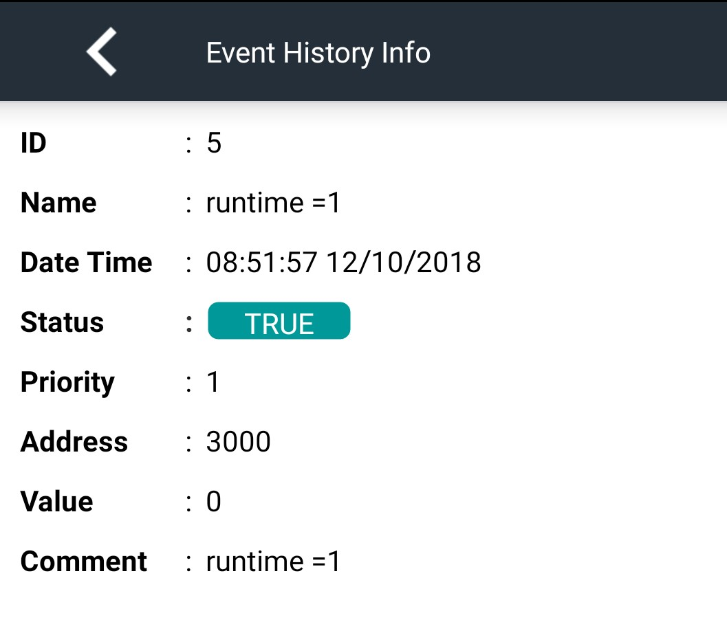
After watching, click on the icon to return to the screen containing the list of event types.
- 3rd zone: Here we can select each specific Device by clicking the icon interface that appears as follows:
5. Support contacts
|
Distributor in Malaysia
AVO Technology Sdn. Bhd. Official Website: www.avo.com.my No. 17, Jalan 3/23A, Taman Danau Kota, 53300 Kuala Lumpur, Wilayah Persekutuan Kuala Lumpur, Malaysia General : +603-4143 2288 Mobile : +012-376 7181 |
Distributor in Australia and New Zealand
Templogger Pty Ltd Tel: 1800 LOGGER Email: contact@templogger.net |
|
Manufacturer
Dai Viet Controls & Instrumentation Company Ltd. Email: info@daviteq.com | www.daviteq.com |
|

No Comments